Theming with RapiDoc
If you’ve worked with themes in a web application, you know how difficult it can be. RapiDoc is used in many corporates for API documentation, and every organization has its style guide to follow.
Apart from aligning to an organizational style guide, theming can also be helpful to layout information based on the target audience. That is to say, API documentation for a regular API developer can be very differently laid out than for an end-user. In one case the regular API user may be more interested in APIs request and response schema, whereas a new user would be looking for detailed descriptions usage examples code snippets, etc.
Theming options
When you insert <rapi-doc> element in an HTML, It is important to note that none of the existing style or css declarations will affect RapiDoc as this is a native web-component and they inherently provide style encapsulation
Well, this may be good for <rapi-doc> as its styles won't get accidentally messed up, but it also makes it harder to change the styles of internal elements. However, listed below are some of the options which you may use to achieve your desired styling
- RapiDoc attributes
- CSS Parts
- Inject custom HTML, CSS and JS using <slot>
- Inject HTML using markdown
- CSS vars
CSS Parts
While most of the styling needs can be taken care of by attributes, but if a very specific need is there to target and style a particular section in the document then RapiDoc provides many CSS parts that can be used to style them
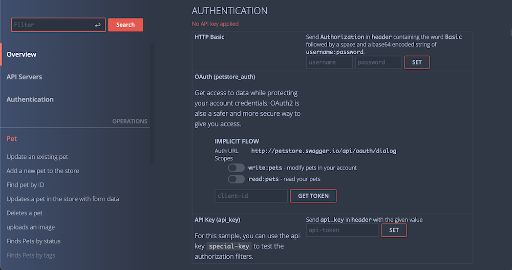
For instance, you can change the background and text color of the side navigation bar, but what if, when you need to apply a mix of multiple colors with a gradient? To achieve this you can use CSS to target specific sections of RapiDoc using ::part selector

        <html>
        ...
          <style>
            rapi-doc::part(section-navbar) { /* <<< targets navigation bar */
              background: linear-gradient(90deg, #3d4e70, #2e3746);
            }
          </style>

          <rapi-doc spec-url = "https://petstore.swagger.io/v2/swagger.json"
            theme = "dark"
            primary-color = "#f54c47"
            bg-color = "#2e3746"
            text-color = "#bacdee"
            show-header = "false"
          > </rapi-doc>
        ...
        </html>
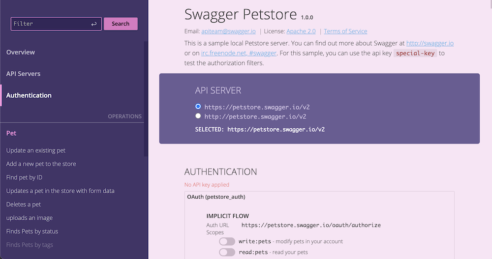
Likewise, there are many ::part selectors you can use that RapiDoc exposes for styling. Let's take another example and this time we would highlight the Servers section by giving it an alternate background color as shown below

          <html>
            ...
            <style>
              rapi-doc::part(section-servers) { /* <<< targets the server div */
                background: #6b5b95;
                color:#d1c2e4;
                margin:0 24px 0 24px;
                border-radius: 5px;
              }
              rapi-doc::part(label-selected-server) { /* <<< targets selected server label */
                color: #fff;
              }
            </style>
            <rapi-doc  spec-url = "https://petstore.swagger.io/v2/swagger.json"
              show-header = "false"
              nav-bg-color = "#423368"
              primary-color ="#df75c4"
              bg-color = "#fae4f5"
            > </rapi-doc>
            ...
          </html>
Another Example to change the button styles | Demo
          <html>
            ...
            <style>
              rapi-doc::part(btn){ border-radius: 15px; }
              rapi-doc::part(btn-try) {
                background-color: yellow;
                color: #333;
                border-color: yellow;
              }
              rapi-doc::part(btn-selected-response-status) {
                background-color: yellow;
                color: #333;
                border-color: yellow;
              }
            </style>
            <rapi-doc  spec-url = "https://petstore.swagger.io/v2/swagger.json"
              show-header = "false"
              nav-bg-color = "#423368"
              primary-color ="#df75c4"
              bg-color = "#fae4f5"
            > </rapi-doc>
            ...
          </html>
Following are the list of css ::part provided by rapidoc. The names of these parts should be self explenatory
| Sections |
| section-navbar, section-navbar-search section-navbar-item, section-navbar-active-item, section-header section-main-content, section-logo, section-overview, label-overview-title, section-auth, section-auth-scopes, section-servers, section-tag, section-operations-in-tag, section-operation |
| Containers/ Wrappers |
| wrap-request-btn |
| Labels |
| label-header-title, label-overview-title, label-selected-server, label-tag-title, label-operations-method, label-operation-path |
| Buttons |
| btn, btn-fill, btn-outline, btn-search, btn-try, btn-fill, btn-clear, btn-copy, btn-clear-resp, |
| Checkboxes/ Toggles |
| checkbox checkbox-auth-scope |
| Inputs |
| textbox, textbox-param, textarea, textarea-param, file-input |
| Anchors |
| anchor, anchor-overview, anchor-param-example |
CSS Variables
RapiDoc uses many CSS variables style its content. These CSS variables can be changed directly in HTML
